- Sub-metric · What's measured
Total number of screens
How many times the user clicks to the next screen
- Score
1 / 5
- Why this score — And not more
- 12 screens in total — well past the ≥5-screen floor: account selection, existing-customer check, personal identity, residential address and contact, business structure and tax classification, entity details, business address, two screens of business-activity questionnaires, control-person certification, beneficial-owner details, and terms.
Business
Capital One's Conversion Scorecard
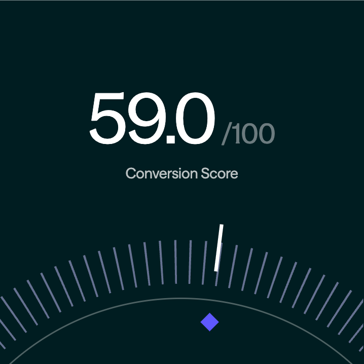
Capital One scored a 59 / 100 for customer conversion on its business bank account application when completed by a business owner.
Why SOLO Scores
SOLO works with 100s of fintech programs to optimize the unit economics and customer conversion of their data collection processes on behalf of their sponsor banks. This research provides a baseline for the impacts of data reusability through the SOLO network.
What’s behind the score.
Capital One's initial application is fast to fill and asks nothing twice: under ten minutes of hands-on time, no account connections, sensitive data staged in a sensible order, and an applicant who finished without help. What holds the score back happens after the first “submit” button — 70 fields with no pre-fill, then three document requests that arrived more than 24 hours later through a confusing portal, stretching a ten-minute application into a multi-day wait for an account that still was not funded.
data fields across 12 screens
User Effort
start to finish, inclusive of follow up tasks
Application time
proactive updates between submission and the first follow up task
Decision speed
across all data transparency sub-metric — disclosures present but dense
Outcome transparency
Methodology
SOLO reviewed the application across four primary categories: User Effort, Application Time, Decision Speed, and Outcome Transparency. Each sub-metric is scored 1–5 against a fixed rubric.
Full Scorecard
17 SUB-METRICSOpportunity
Highlights
Wins, losses, and what the network would fix.
- Category
User effort
- Wins
- Nothing is asked twice — every question is a net-new fact. Sensitive data such as SSN is requested only where needed and staged in a sensible order, no account connections are required, and the applicant finished the form entirely on their own.
- Losses
- 70 fields across 12 screens with zero prefill — including two screens of business-activity questionnaires. Three document requests landed after submission through a confusing portal (a driver's license offered as proof of business address), and there is no save or resume if the window closes.
- Opportunities
- A reusable KYB certificate clears the formation documents, legal-name verification and operating-address evidence in one permission — the three uploads disappear. Identity, address, ownership and citizenship for the applicant and each owner are prefilled from the network; the customer confirms rather than types.
- Category
Application time
- Wins
- 9:47 from first screen to submission — the 7–10 minute band — despite 70 hand-typed fields. The form itself is efficient, however it delayed the friction rather than removes it.
- Losses
- The follow-up request arrived more than 24 hours after submission, and completing it took another two days once the applicant re-opened the link. The timer effectively restarts after “submit.”
- Opportunities
- With entity and identity data prefilled and documents already verified, the application collapses to a few confirmations — under three minutes — and the post-submission document cycle is removed entirely.
- Category
Decision speed
- Wins
- Submission was acknowledged immediately with a confirmation that the application was complete and pending.
- Losses
- No proactive communication beyond that confirmation. The first follow-up took over 24 hours, the full application period ran to multiple days, and the account remained unfunded — the customer was still not onboarded.
- Opportunities
- Pre-verified network evidence makes the application decisionable at submission: the manual document review that drove the multi-day wait has nothing left to review.
- Category
Outcome transparency
- Wins
- The pending outcome clearly explained which additional criteria had to be satisfied before a decision could be made.
- Losses
- Data-use policies exist but are buried in the terms and conditions, and there is no call-out of how data is used on an ongoing basis or any control over who can see what.
- Opportunities
- Consent-based sharing gives the applicant a plain-language, revocable view of what was shared, with whom and why — turning the buried T&C language into a visible control surface.